Independent app review · Evidence checked August 31, 2026
Clear review 2026: minimalist task lists, revived
Clear became memorable by removing buttons and teaching people to pinch, swipe and pull a list into shape. The revived app keeps that tactile minimalism while adding enough modern flexibility to be useful again. It is still a list, not a project manager.
 Clear
ClearOur take
Is it worth using?
Clear is delightful for short personal lists, errands and routines when conventional task apps feel like forms. Its gestures are fast once learned, and the heat-map colors make priority visible. Skip it for collaboration, complex projects or a mixed-platform work system. Apple Reminders is more practical; Clear is more enjoyable.
Inside the apps
What they actually look like
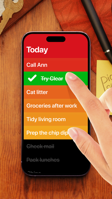
These screenshots come from the apps' current App Store listings. They are not mockups we made for the article.
What users report
What starts to matter after a week
We read recent reviews for Clear to look for praise and friction that product pages leave out. They are anecdotes, not a vote, so they challenge our testing rather than decide the verdict.
Recent reviewers repeatedly call Clear quick, simple and intuitive. One is particularly pleased to see the app active again after a long quiet period, which also explains why update history matters here.
The quick version
The differences that matter
- Best for
- Short, tactile personal lists on Apple devices
- Price model
- Free download with optional upgrades
- Main strength
- Fast gestures and unusually satisfying interaction
- Main weakness
- Minimal structure for projects and collaboration
- Priority model
- Color heat map and list ordering
- Best alternative
- Apple Reminders for utility; Things 3 for projects
The gestures make list maintenance feel physical
A swipe completes an item, a pinch creates space and dragging changes order. The interface removes much of the chrome that makes a small list feel like data entry.
There is a learning moment because the controls are not all visible. After that, the speed and musical feedback can make ordinary checking-off feel unusually deliberate.
The heat map is simple priority without another field
Color can make the top of a list feel urgent without asking for labels, flags and a filter. The list remains readable because priority is part of its appearance rather than a separate workflow.
That simplicity works for a packing list or errands. A serious project needs more than order and color, particularly when dates, people and dependencies enter the picture.
The revival matters because trust has a history
One recent reviewer is pleased to see Clear active again after what they describe as suspended animation. The current listing shows a fresh update on August 31, 2026, which is encouraging.
A revived app still has to rebuild confidence that it will remain maintained. People putting essential reminders into Clear should check export, backup and update behavior before treating the list as permanent infrastructure.
Minimal does not mean universally easier
Recent reviewers call the app quick and intuitive, but gesture-first controls can be less discoverable and less accessible for people who prefer labeled buttons or keyboard-heavy work.
Clear makes a specific trade: less visible machinery in exchange for learning its movement. That is a better design choice than simply deleting features, but it remains a trade.
Flaws, but not dealbreakers
There is little room for deep projects, shared ownership or custom views. The visual style can also become the reason to use the app when a built-in reminder would be more dependable.
For the right small lists, delight is not frivolous. An app you enjoy opening can be more useful than a powerful one you avoid. Clear earns a place by making that narrow case convincingly.
Good to know
A few common questions
Is Clear still being developed?
The US App Store listing showed version 2.7.8 released on August 31, 2026 when we checked.
Is Clear free?
It is free to download with optional paid upgrades.
Can Clear replace Things 3?
Only for short, simple lists. Things 3 provides much deeper project and daily-planning structure.
Sources
Where we checked the facts
We use the app maker's own pages for prices and features. Reviews and community posts are useful for spotting problems, but one person's experience is still one person's experience.
- 01OfficialClear product pageView source
- 02App StoreClear US App Store listingView source
- 03App StoreRecent Clear US App Store reviewsView source